Highly recommend the website service, these guys go over and beyond to offer the best service. Really happy with my new site Pete M Director PM Properties
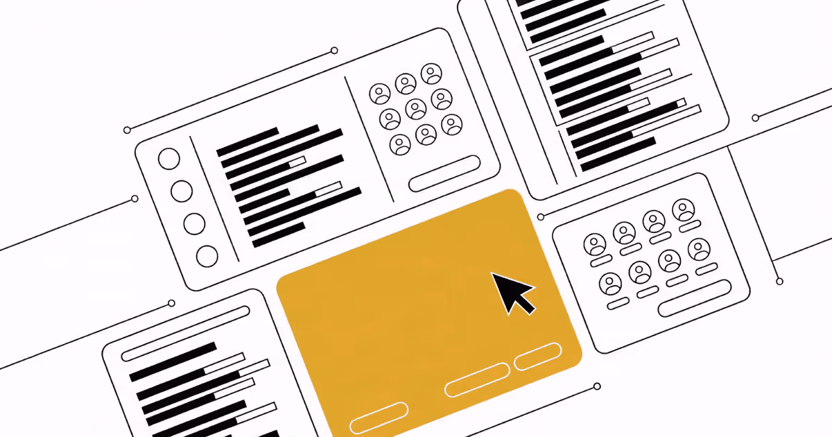
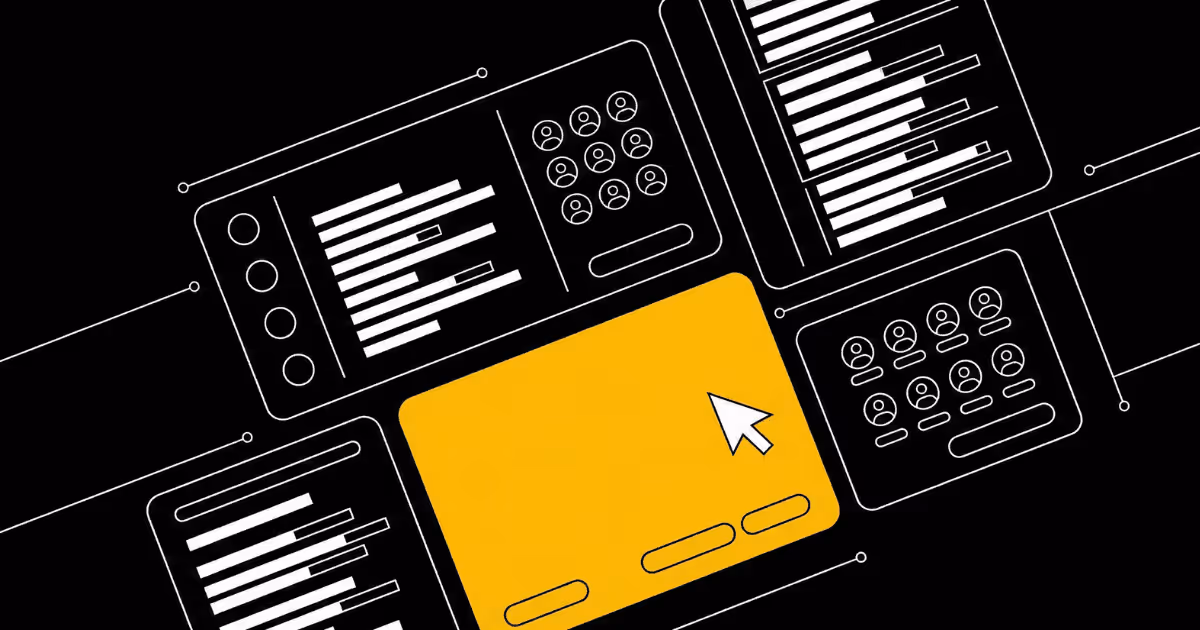
SaaS dashboard design
- Data first dashboards for real users
- Clear UX for complex products
- Patterns for admin, analytics and settings
- 5.0 / 5.0Rating on Google
- 100+Projects completed
- On demandNo contract tie-ins
- Expert teamOf digital pros
Service details
We design SaaS dashboards and product interfaces that make information easy to understand and act on. You get clear layouts, considered flows and reusable patterns that fit your product roadmap.
Book a call to discuss your project
15-30 minute strategy call, no charge
Dashboards that help users do their jobs
A dashboard is not just a collection of charts. It is a workspace where people make decisions, monitor what matters and figure out what to do next. Many SaaS products treat dashboards as an afterthought and end up with crowded screens that look impressive in screenshots but feel overwhelming to use. Our SaaS dashboard design service is built to change that. We design around the real work your users are trying to get done.
We start by understanding who uses your product, what they are responsible for and how they currently use data. Are they trying to catch issues early, report upwards, plan work, manage customers, or all of the above. That context shapes everything from which metrics appear on the first screen to how deep someone needs to click to find supporting detail.
Putting user goals and workflows first
Before we think about charts, we map workflows. We talk through the key questions your users ask each day. For example, what is wrong right now, what changed, where should I focus, who needs help and what is next. We then shape flows and layouts that answer those questions in a logical order.
This often means starting with a small set of headline signals, then giving people a clear path into more detail. We avoid forcing users to hunt for important information. Instead, we design dashboards so next steps feel obvious and the interface supports how work actually happens.
Making complex data feel simple
Most SaaS dashboards deal with messy data. Different timeframes, segments, accounts, products and teams all compete for attention. Our job is to make that complexity feel manageable. We choose chart types and layouts that match the story you want to tell, rather than adding visual noise.
We pay particular attention to hierarchy and comparison. Important numbers and states stand out. Secondary information supports them without getting in the way. Filters and controls are placed where they feel natural, with clear defaults and sensible empty states. The result is a dashboard that feels calm even when the underlying data is busy.
Patterns for analytics, admin and settings
Dashboards rarely exist on their own. They usually sit inside a wider product that includes lists, detail views, settings and workflows. We look at the whole picture. Alongside main dashboards we define patterns for supporting screens such as account lists, activity feeds, detail pages and configuration areas.
These patterns share a visual language and interaction logic. Once users learn how one part of the interface behaves, that learning transfers to other parts. This makes the product feel smaller than it really is and reduces ongoing support questions.
Designing with product teams and engineering in mind
SaaS dashboard design only works if it respects your product architecture and engineering constraints. Throughout the project we keep your technical reality in view. We consider how data is queried, what is available in real time, what is aggregated and what would be expensive to show.
We design in Figma with components and variants that fit common front end approaches. States such as loading, error, empty and partial data are designed explicitly. This helps engineers implement the interface more accurately and makes it easier to maintain as the product evolves.
Supporting long term product growth
A good dashboard should be able to grow without collapsing under its own weight. We design with future features and metrics in mind. That might mean leaving space for additional cards, planning how new filters slot in or defining how to tuck away less important modules without hiding them completely.
We also consider how feedback and learning will flow back into design. Clear patterns make it simpler to test variations on modules, adjust thresholds or add explanatory copy when users struggle to understand a metric. You end up with a living dashboard that can evolve alongside your product, rather than a one off design that quickly becomes outdated.
Built for B2B and product led teams
This service is a strong fit for B2B SaaS, internal tools and data heavy products where dashboards and admin panels play a central role. Whether you are shipping a first version or improving a dashboard that users find confusing, we bring structure, clarity and an understanding of how teams actually use product data day to day.
What you get
User and workflow discovery
Short, focused sessions and a questionnaire to understand your users, their goals, their daily questions and how they currently use your product.
Information architecture and layout plan
A simple outline of dashboard structure, navigation, key metrics and how different screens link together.
Wireframes for key dashboards and flows
Low fidelity layouts for core dashboards, detail screens and any critical supporting views, focused on hierarchy and workflows.
High fidelity dashboard and UI design
Detailed Figma designs for agreed dashboards and related screens, including charts, tables, filters and core interactions.
Component and pattern library
A set of reusable components and patterns for cards, filters, tables, states and navigation that can be used across your product.
Handoff and product team walkthrough
Organized Figma files, annotations for tricky behaviors and a walkthrough session with your product and engineering teams.
How we work
Kickoff and discovery
We review your product, users, data sources and technical context, then agree which dashboards and flows are in scope.
Goals, questions and structure
We map user goals and core questions, then outline the structure of dashboards, metrics and supporting views.
Wireframing and validation
We create wireframes for key screens, review them with your team and refine until the flows and hierarchy feel right.
Visual design and handoff
We translate wireframes into detailed designs, build out components, annotate behaviors and walk your team through the final Figma files.
Zac and his team are fantastic! They listen to everything you want and don't try to sell you something you don't. They offer professional advice and do everything to help you find success through your website. Day 1 our site went live, we already had an inquiry. Highly recommend them, you won't be disappointed!
South digital have done a great job designing my website and helping to launch my mobile app. The team are always on hand to answer any questions. Quick service with high quality.
South Digital did an absolutely amazing job on our new website. It exceeded expectations in every way. Not only do their websites look amazing but they also understand functionality and conversion so your website will actually drive revenue for your business.
Grow your website on demand with us
From first brief to launch and beyond, South Digital partners with ambitious teams to plan, build and grow your website.
SaaS dashboard design FAQs
Do you only design dashboards for customer facing products?
No. We design both customer facing dashboards and internal tools. Admin panels, operations dashboards and internal reporting views follow similar principles, and we are comfortable working across both.
How much product knowledge do you need from us?
We lead the design process, but we rely on you for context about your users, data and constraints. That usually means a kickoff session, access to the current product and availability of a product owner or subject matter expert for questions.
Can you work with our existing design system?
Yes. If you already have a design system, we use it as the foundation for dashboard and UI work, and extend it carefully where new patterns are needed. If you do not have a system, we create lightweight patterns that can grow into one over time.
Do you handle data visualization choices as well as layout?
Yes. We think about which chart types and visual treatments will best support each metric and question. We avoid unnecessary flourishes and focus on clarity, comparison and trend recognition.
How do you balance power and simplicity in dashboards?
We try to give expert users enough control without overwhelming everyone else. That often means smart defaults, clear summaries and the ability to drill down only when needed. Advanced options are available but do not dominate the screen.
Can you help us test dashboards with real users?
We can support simple user testing and feedback sessions, either during or after the project. That might include structured interviews, guided walkthroughs or quick remote tests, with findings fed back into the design.
Do you also work on the marketing site for our SaaS product?
Yes. Many clients ask us to design both their product dashboards and their marketing site or key landing pages. This keeps the brand and experience consistent from first visit through to daily use of the product.
Related services
Website design
Plan and design websites that look modern and convert. South Digital designs clear, conversion focused sites for growing teams in Webflow, Framer and WordPress.
Landing-page design
Turn clicks into customers with focused landing pages. South Digital designs high converting landing pages for ads, email and product launches in Webflow
Brand style guide
Create a practical brand style guide that is easy to use. South Digital designs digital first brand guidelines covering logo use, color, typography and
Logo design
Create a logo that feels clear, modern and easy to use. South Digital designs digital first logos and brand marks that work across your website, product and
Wireframe architecture
Plan your website before you design it. South Digital creates wireframes, site maps and user flows that give your content a clear structure and make design
Custom API integration
Connect Webflow, Framer or WordPress to your CRM, booking tools and internal systems. South Digital designs and ships secure, well documented API integrations
Let's make it happen
Commercial thinking
Every decision ties back to the job of the page.
Fast, accessible builds
Performance and usability stay in the build.
Reliable delivery
Clean systems, clear QA and steady communication.
Easy to keep improving
We fit your team, tools and workflow.


